One of the most requested features for Pearl Comments is to the capability to control how comments are displayed in the sidebar and on the page. As we already mentioned, in the 1.5 release of Pearl Comments for Firefox (and other Mozilla-based browsers) you can control the appearance of the comments using CSS. Most of the elements we use to render comments have CSS classes assigned to them.
All Mozilla-based browsers allow users to customize the display of web pages via a configuration file named userContent.css. To customize Pearl Comments, you add CSS rules to that same file. The first step is to find your profile folder. Inside the profile folder, you will find a folder named chrome. Inside the chrome folder you will need to create a text file named userContent.css (if that file already exists you can simply add more CSS rules to it). There is detailed information available on mozilla.org’s site. Remember to restart your web browser after changing the userContent.css file.
Here is a diagram that shows the classes you can use to customize the sidebar display:
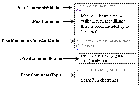
Additional notes: the comment text is contained within an iframe, and the body of that iframe has the class PearlCommentSBBody. Also, if a comment has a status such as “In Progress” an additional class is assigned to its PearlComment element. The additional classes are:
-
* PearlCommentStatusInProgress
* PearlCommentStatusCompleted
* PearlCommentStatusClosed
Here are some examples that demonstrate how to customize the display of comments in the sidebar:
To hide the comment text, add this rule to your userContent.css file:
.PearlCommentsSidebar .PearlCommentFrame { display: none; }
To hide the topics, add this rule:
.PearlCommentsSidebar .PearlCommentsTopic { display: none !important; }
To display all text using a 9pt font, add these two rules:
.PearlCommentsSidebar * { font-size: 9pt !important; }
.PearlCommentSBBody { font-size: 9pt !important; }
If you want to use black text for the date and author (instead of the medium gray color used by default), add a rule like this one:
.PearlCommentsSidebar .PearlCommentsDateAndAuthor { color: black !important; }
To show “In Progress” comments on a light blue background, use:
.PearlCommentsSidebar .PearlCommentStatusInProgress { background-color: rgb(0,255,255) !important; }
Similar techniques are used to customize the display of comments that are shown on web pages. Here is a diagram that shows the classes you can use:
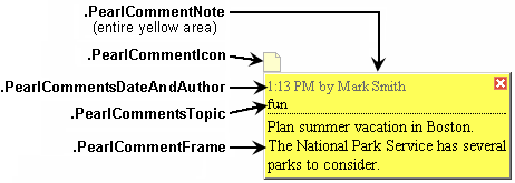
Additional notes: the comment text is contained within an iframe, and the body of that iframe has the class PearlCommentNoteBody. Also, if a comment has a status such as “In Progress” one of the status classes mentioned earlier is added to the PearlCommentNote elements as an additional class.
For example, if you’d like “Completed” comments shown on web pages to have a white background instead of a green one, add this rule to your userContent.css file:
.PearlCommentNote.PearlCommentStatusCompleted { background-color: white !important; }
To display topics in blue, add:
.PearlCommentNote .PearlCommentsTopic { color: blue !important; }
You can also control the appearance of the icons that shown on web pages. By default, they are somewhat transparent (opacity: 0.3). To remove the transparency entirely, add this rule to your userContent.css file:
.PearlCommentIcon { opacity: 1.0 !important; }
We plan to provide more extensive documentation soon, but this should get you started. If you want to tweak something and cannot figure out how, do not hesitate to ask us.